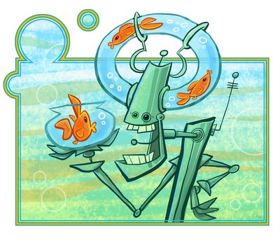
 FISH ON THE BRAIN
This is my departure from AFC this week. This image stuck in my head recently so I decided to jot it down - and try another loose paint approach. I think the robot may be trying to convince his "customer" to relocate into his nice, spacious cranium. It looks like some kind of deal is being made - like a car salesman for fish.

18 comments:
Oh WOW, just found you're blog. Really cool illustrations you have here. Great to find you. I'll be back for more.
Look cool :)
Yowza! That's a great one.
mmmmmmmmmmmmmmmmmmmmmmmmmmmmmmmmmmmmmmmmmmmmmmmmmmmmmmmmmmmmmmmmmmmmmmmmmmmmmmmmmmmmmmmmmmmmmmmmmmmmmmmmmmmmmmmmmmmmmmmmmmmmmmmmmmmmmmmmmmmmmmmmmmmmmmmmmmmmmmmmmmmmmmmmmmmmmmmmmmmmmmmmmmmmmmgood...jm
that meant to say mmmmmmmmmgooooddddd!!!really nice one dave!!!
Cool Design Dave!
The other fish look happy enough. But I can't help feeling there is a nefarious ending to this story.
I love theis one. One cause i like water,...so you have me from the get go on that. 2 because of the super inventive way you incorporated the fish tank on his head.Very fun ,cool ,and creative. Also,.Great pallette as well. At the smaller size it looks like a finished illo. It's only when you blow it up and see the shaky linework that it doesn't look finished. I would take the time to do it up right. It's 90% there and is a great image.
WOW....cooooolll :)
Very nice work! I enjoyed looking at your entire blog! Thanks for posting!
HeY Xhu!
I like the goldfish in these. it's a really cool idea, a robo with a fish tank on head. I like it.
You got it all here Dave: awesome shapes and color palette, just the right amount of texture, and of course, ROBOTS!
You should design a whole line of these and start selling them as postcards from the future. I'd be in line for a set.
Great color work. Nice piece.
MAC
Interesting - I didn't notice the shaky lines unitl "kevin barber", if that's his real name, said somethin'.
Really dig though Dave. I have to assume that antenna in his mouth gets in the way when he's eating. Crappy reception I bet...
Personally I prefer the "shaky" linework. It has a warmth to it that you lose when you go for the smooth, vector, animation cleanup style look. I wouldn't touch it, but to each his own.
I agree, I absolutely love this illustration and I think the "shaky" line-work is part of what adds to the charm of this character. I think it's fabulous just the way it is.
ooooh !! This is TOOO COOL!
Post a Comment