FROG DISSECTION
Since I posted the animation less than a week ago, it's not too late to show the bare bone beginnings of this short project. I was fairly shocked to see what I originally scribbled - here it is for you to see!
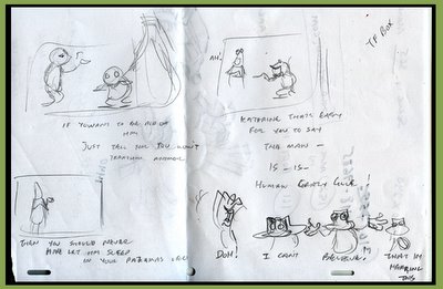
When I heard the sound clip, I roughed out this page. These are the first thoughts captured on paper before I began to flush out anything else. For whatever reason, I decided on frogs. I must have just wanted to draw frogs at the time, but there were some design elements that lent themselves well to Flash animation design and simplicity (such as the thin "stick" arms). There were no other storyboards done - this was enough to go by. You can see some idea of what was to be animated - but everything is much subtler here. One interesting thing to note - I was originally going to place the big frog behind the Therapist frog (Leo). You can see a big rough shape in the first panel. It was going to be more of a surprise, and he would notice that the guy he was talking about was standing behind him the entire time.
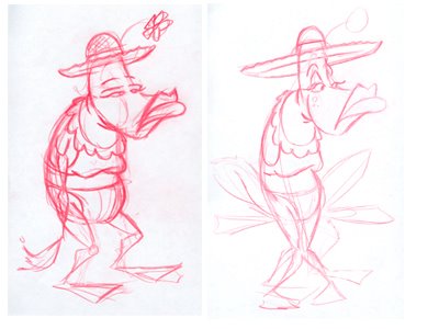
Here are the first character designs for the female frog (Katharine). I don't explore too much. You can see that the first and second designs on her are somewhat similar - the second only having tweaks. I gave her a thinner body to contrast the male frog better, and opted for more expressive eyes that could contain some purple eye shadow. The hat was changed much later to a lillypad design. I also considered having these frogs in a crouched leg position - but I threw that idea away when I knew the frogs needed some easier mobility. Standing on 2 legs would also push them closer to the human side.

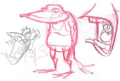
The Male frog (Leo) was meant to be short and dumpy. His initial sketch didn't change much at all. The eyes were pushed closer together - in the sketch he's a little walleyed. Also, here is a ruff open mouth pose and a quick sketch to help me work out the yell near the end of the dialogue.

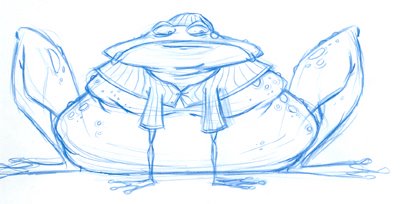
Lastly, Here is the design of the big purple frog at the end. I hesitated on the out of focus effect - not wanting to loose the detail of this adorable guy. In the end, I decided the focus should be on Leo, and leave this guy in the distance listening in. I'm not sure if I made the best decision - I would have liked to see more of this fellow.
If you'd like to see more from the pose/animation stage, let me know!

8 comments:
This is AWESOME see the progress :) the frog are well done :).. I hope to see more :)
Dave,
Nice frog drawings! I would love to see more. I just saw the animation and it looked great!
You have nice work here on your blog! I'll definately be back often..
Thanks so much for visiting my blog. And thanks for the nice comment =) And for the link too!I'm off to do the same...
Cheers!
Eren
I was hoping to save this out so you could click on the ruff board and get a better view - but a friend told me that moving the image breaks the link - so maybe I'll re-post so it can be seen better.
Thanks for the comments so far...
Dave,
Thanks for posting your process.Always interesting to see these things.Also,...for some reason i can't click and enlarge your pics like i can on other blogs.Is this disabled.It would be nice to see detail .
I fixed the size issue on the storyboard image - seems that if you move the pic around as you compose your post - you break the link to the larger image. If anyone knows how to re-establish a broken link in a post, I'd be happy to learn how :)
So - you can see the top image bigger now, but none of the other ones. At least I could fix one! :)
Dave
Love your drawings!
I revisit your frog drawings!! THey are soo much fun to see!!
Post a Comment